Cleanify App Design
Creating an app from scratch in 4 weeks

PROJECT OVERVIEW
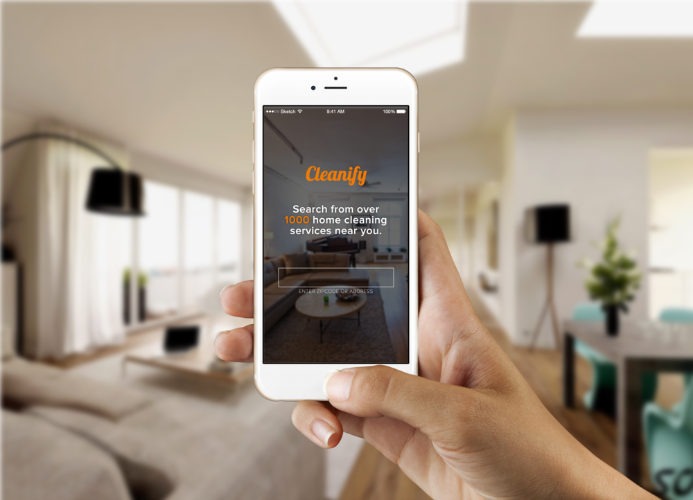
Cleanify is a 500 startups on-demand company that allow people to book cleaning service from local cleaning companies. Cleanify has around 10 employees and does not have a full time designer. Cleanify was experiencing low conversion in the booking flow. We were asked to re-design the mobile experience for their users to improve the flow. The entire design process took 4 weeks to complete. As a product designer, I collaborated with Rachele Lam to re-design the mobile experience. During this end to end project, my partner and I regularly met up with the Cleanify CEO, CTO, and Head of Operation to discuss key points at every stage of the design process.
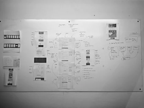
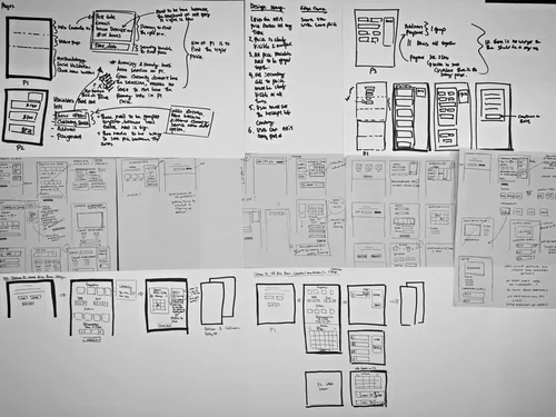
DESIGN PROCESS IN SUMMARY
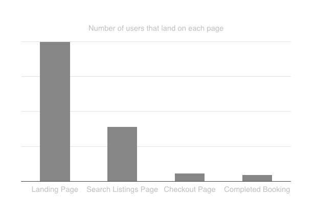
We started off by analyzing the conversion funnel and found that first 2 pages had the biggest drop off
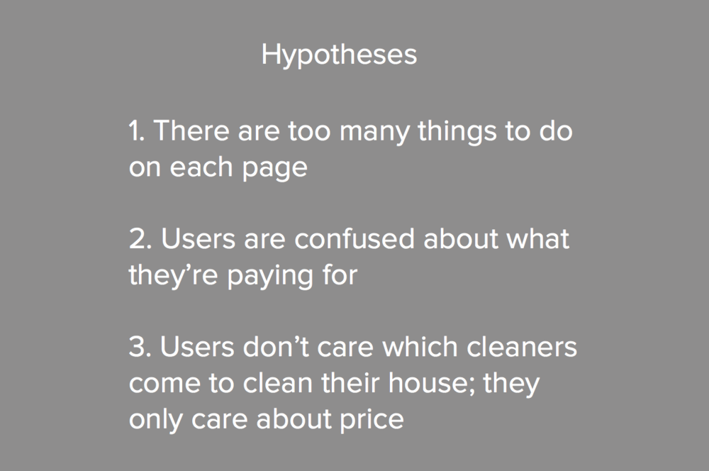
To identify the cause of the problem, we generated 3 hypotheses, then tested them with users
Usability tests validated our hypotheses and led to insights for design considerations
We analyzed our competitors to understand the way to improve the existing cleaning booking flow
With all this information, we produced multiple hi-fi prototypes
We tested prototypes with users, then iterated rapidly
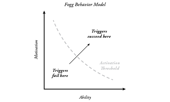
We produced the final version that addressed all the problems that users had, while applying BJ Fogg's behavioral concept
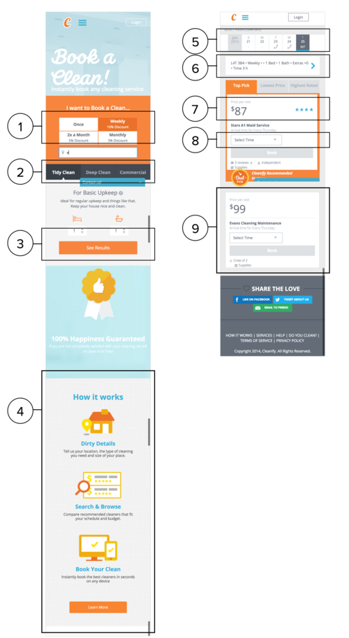
Our final version improved the average time it took for users to complete the booking by 54%
PAIN POINTS FROM USABILITY TESTING
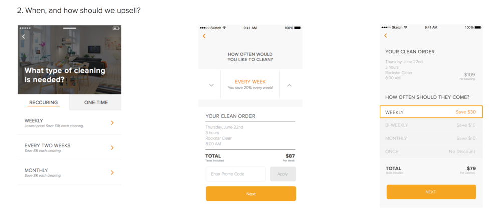
Users' pain points converged down into 5 main types: not understanding how frequency works, unclear value prop, unclear pricing system, unclear length of booking hours, and navigational problem:
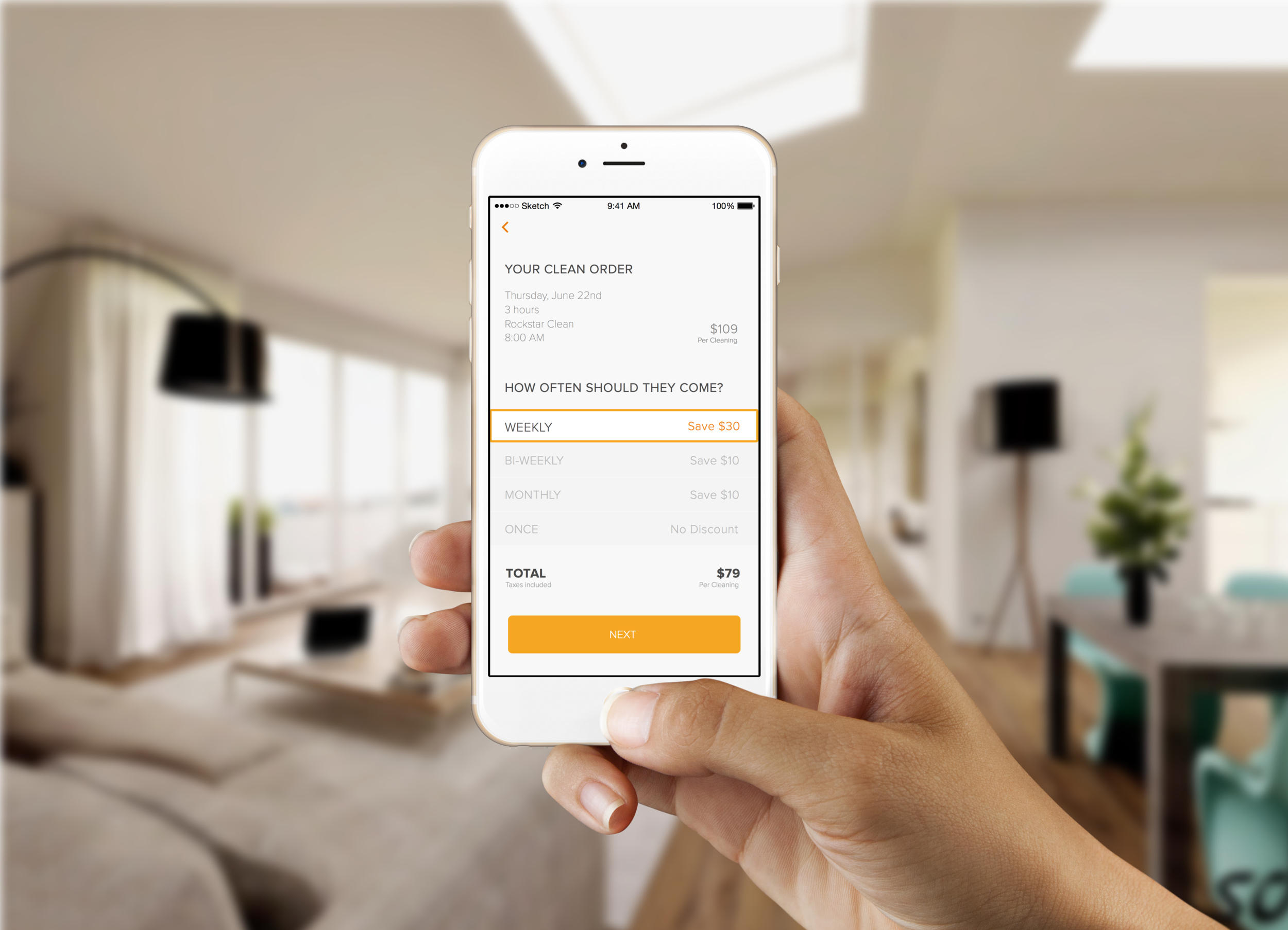
Users wanted more clarity around recurring cleanings. For instance, if it's 2x a month then which week would it be? Which day would they come? Some didn't even touch this
Users did not understand the difference between different types of clean
Didn't fully understand that they were searching for local cleaners in their area - 'results' was confusing
Most users didn't explore the homepage, and those who did, still had hard time understanding the value prop
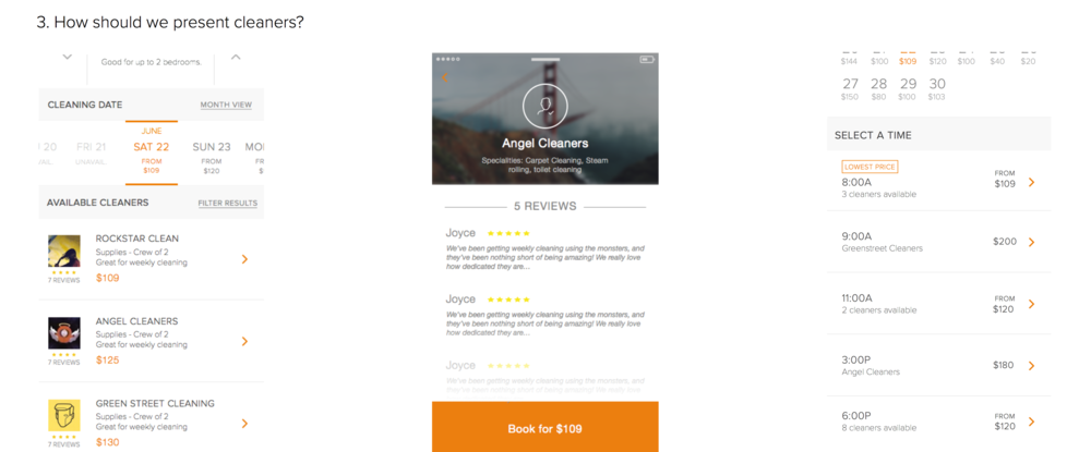
Users didn't understand breakdown of price, and why it kept on changing when they edited filters
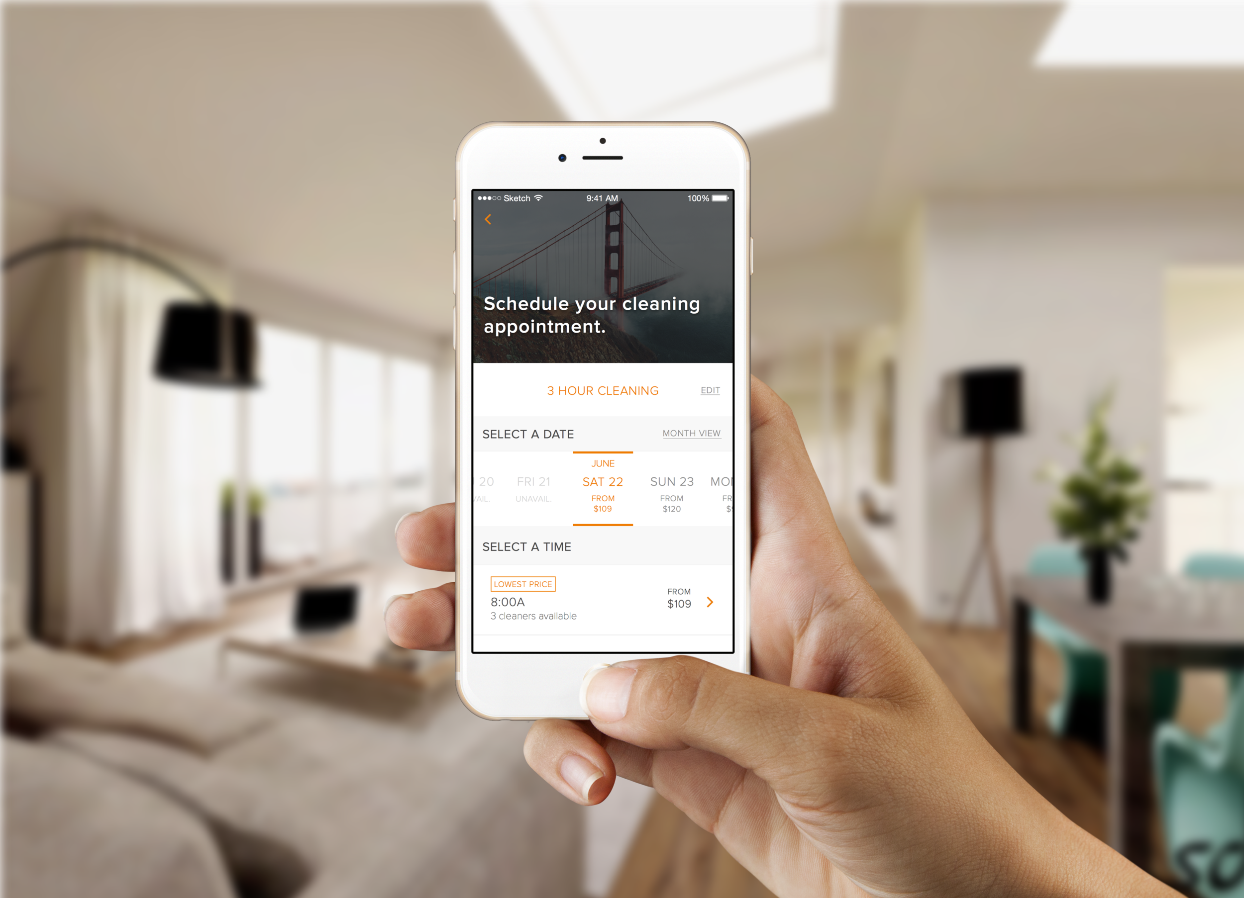
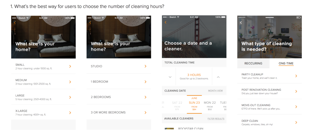
A lot of confusion around the time it takes to clean. Unclear if it was under their control. Some users also missed the # of hours they were booking completely
When users arrived at this page, they were often distracted by the price of each cleaner, that they didn't notice any of the filters
Frustrated that cleaning times were unclear, that they didn't notice any of the filters
Users often did not realize they were booking with a cleaning company
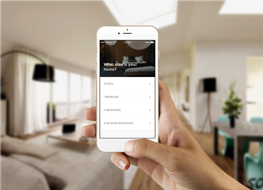
"Oh I didn’t even see any of those filters to enter the number of bedrooms, or type of cleaning" - HAI
“They recommended 7 hours, but the estimated max job time is 4.5 hours. How many hours am I paying for?” - MARVIN
KEY DESIGN DECISIONS
SOLVING PAIN POINTS


