Launching Fanatics' First Mobile App
Designing an intuitive and scalable shopping experience for sports teams and leagues
Year
2016
Role
Lead UX designer
Timeframe
3 months
Results
34% drop in accidental exit from shopping experience
BUsiness challenge
Fanatics runs the official e-commerce business for all major professional sports leagues, major media brands and professional team properties, major soccer clubs (Real Madrid, Man Utd, Arsenal, Chelsea), and Formula 1.
In order to support its many partners, Fanatics had a scalable in-app shopping experience for individual sports teams' mobile apps. However, there was high user drop off and low purchase conversion from the in-app shopping experience. As the lead designer on this project, I defined the design problem with data, outlined the design process, identified potential design directions, and ultimately designed the final product through rigorous testing.
Insights to problem definition
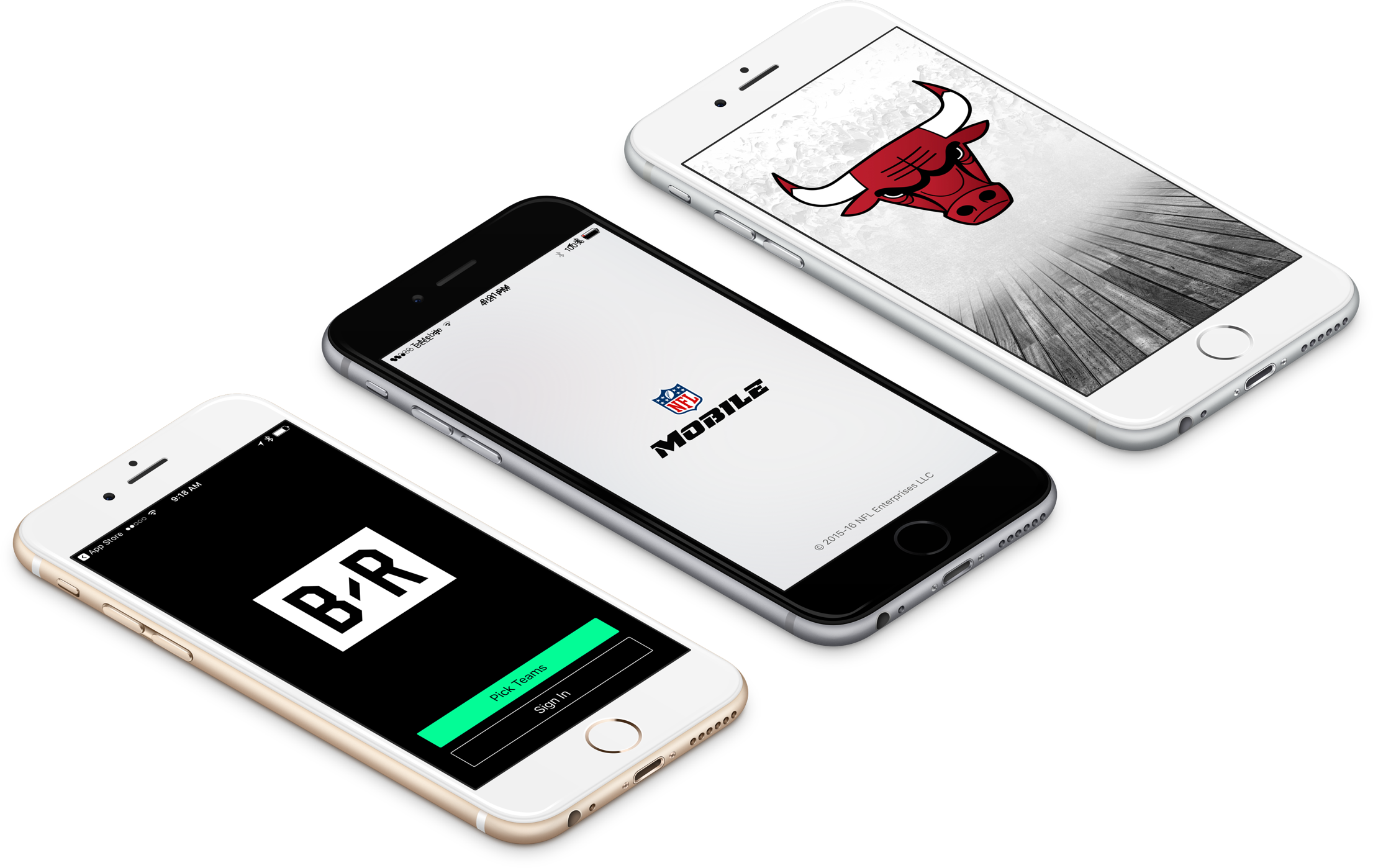
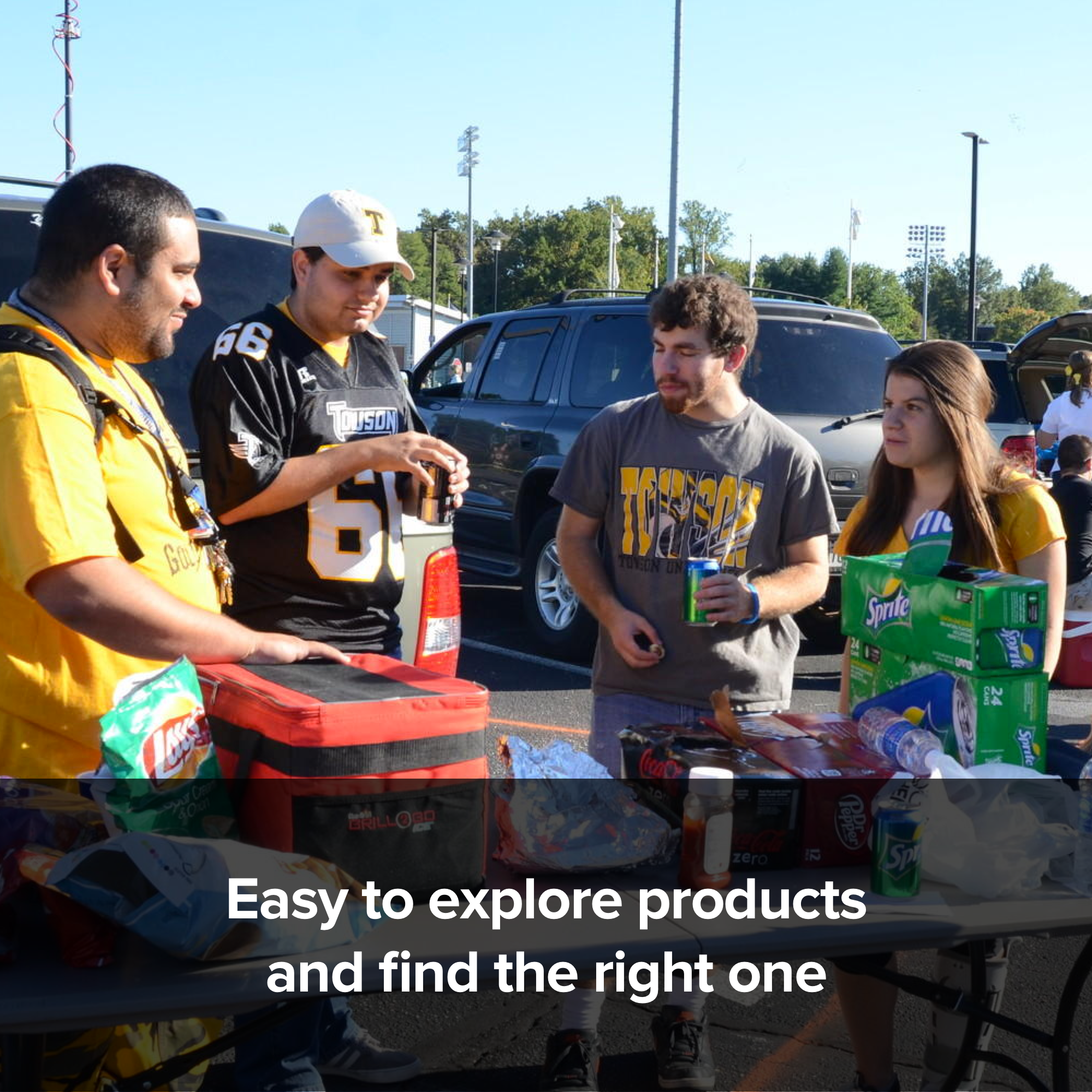
To kick off this project, I first needed to gain a better understanding of why there was low conversion in our partners' mobile shopping experiences. So I conducted over 30 usability tests to understand how users were navigating through the NFL and Chicago Bulls app.
From these usability tests, I discovered a key insight: users were accidentally leaving the shopping section of the app due to poor in-app navigation. This was causing us to lose a lot of potential shoppers.
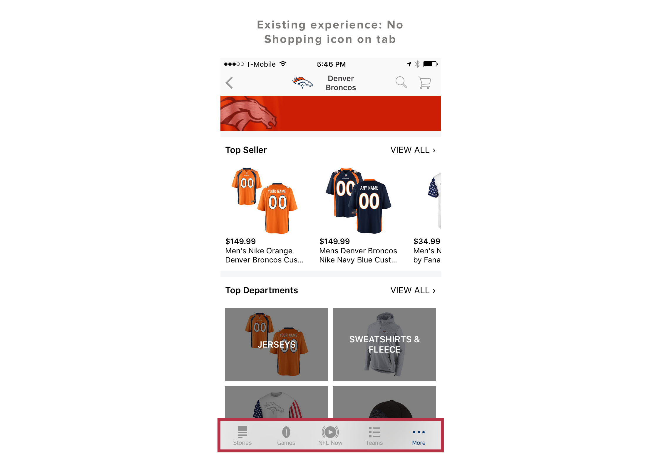
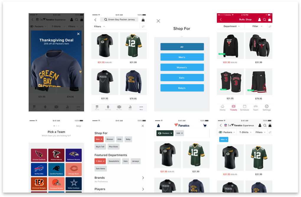
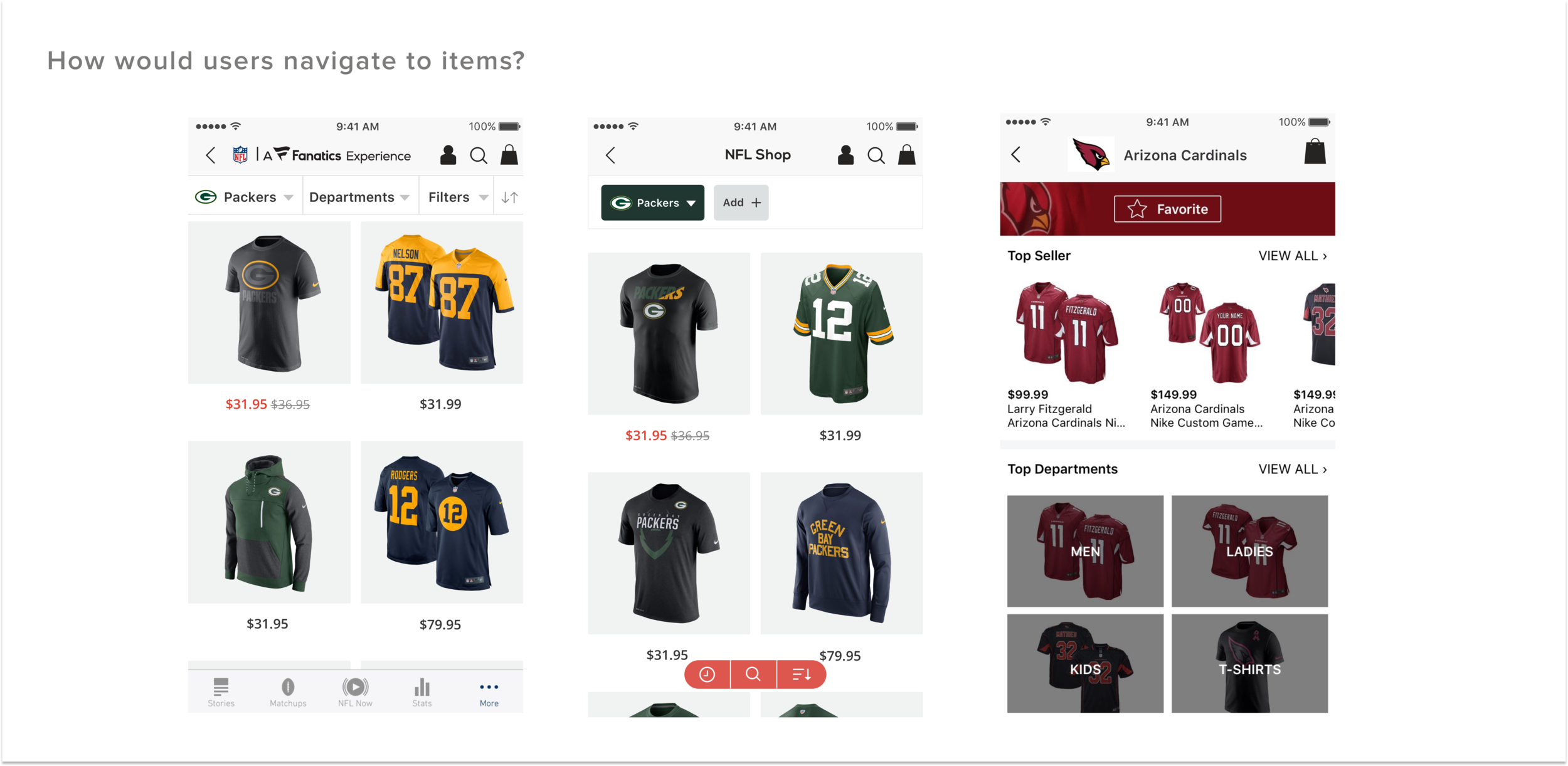
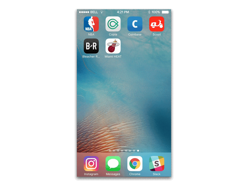
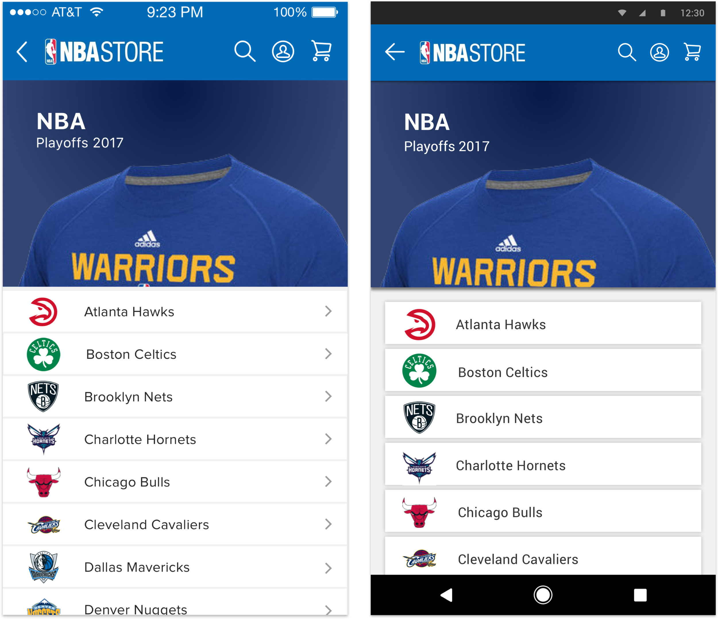
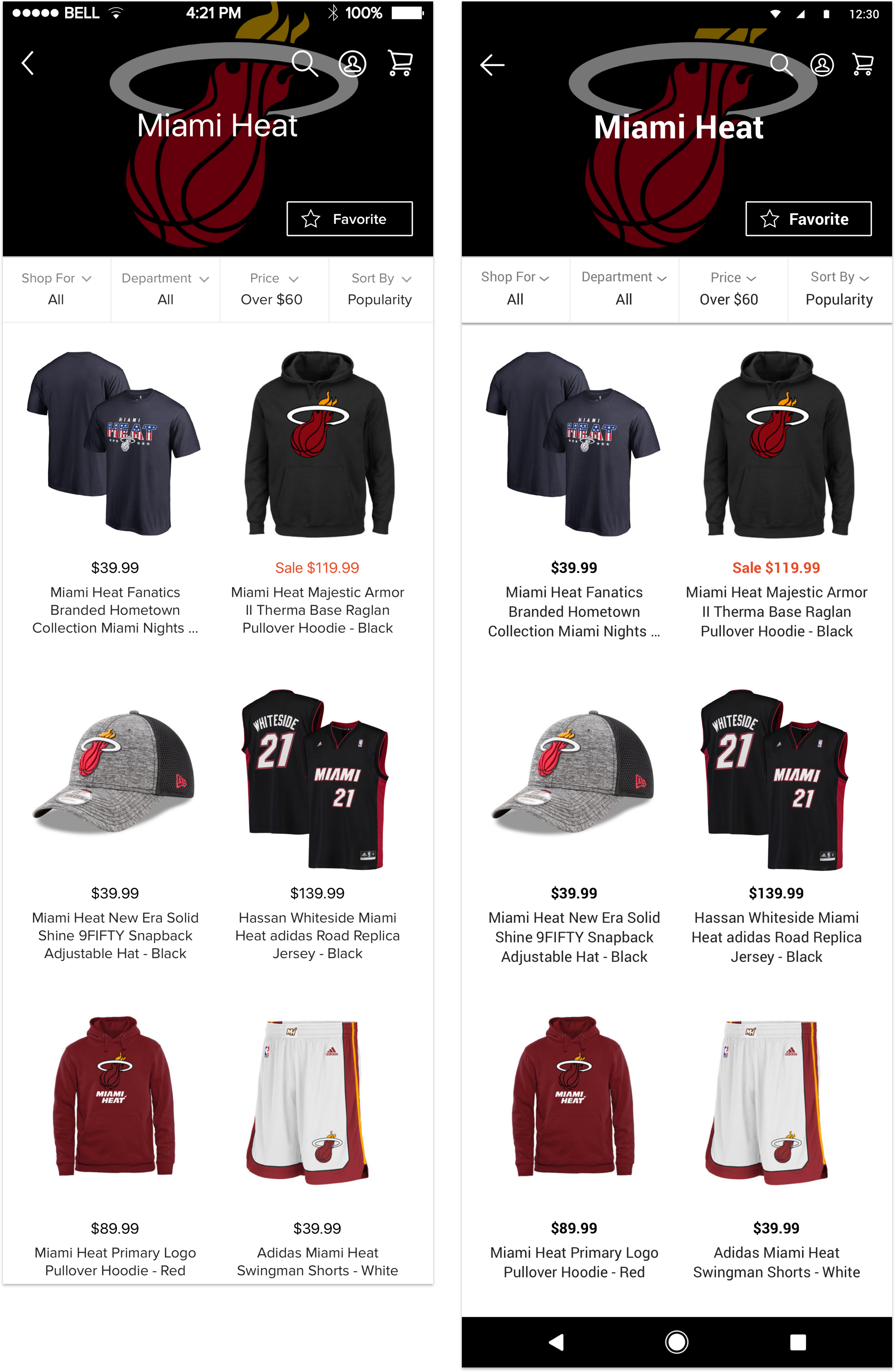
As you can see from the screen shots below, shopping wasn't featured on the inherited parent tab in the NFL app. So as users were browsing, they became frustrated from having to navigate back and forth and would instead tap on the bottom parent tab and be taken out of the shopping experience. Once they were out, it was difficult for them to navigate back to the shopping section.
The Chicago Bulls app didn't have a bottom parent tab, so to validate whether the tab was indeed the cause of the problem, I created a prototype with a tab.
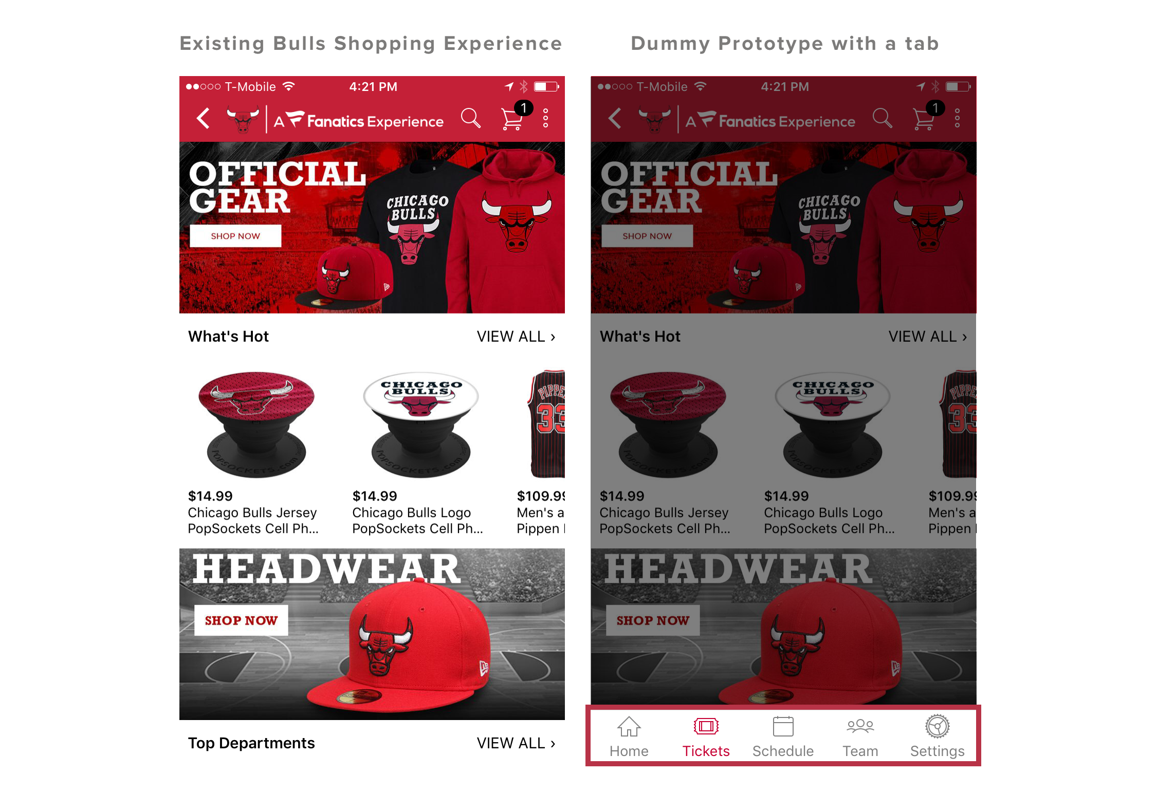
I found that putting a tab at the bottom of the Chicago Bulls shopping experience led to a 63% increase in bounce rate. When users wanted to go back several screens, they tapped on the prominent buttons on the parent tab rather than tapping the back button several times. They did this thinking it would help them navigate to the 'home' shopping screen. Instead, they were taken out of the shopping platform.
Through these usability tests, I was able to define the design problem:
How can we improve the navigation experience for shoppers, with or without an inherited parent tab?
Design Goal
MINIMIZE THE POSSIBILITY OF AN ACCIDENTAL EXIT ON SHOPPING PLATFORM
Design process
Define design objectives and exploratory directions
Now with a clearly defined problem and goal, I kicked off my design process to determine my design objectives and potential directions:
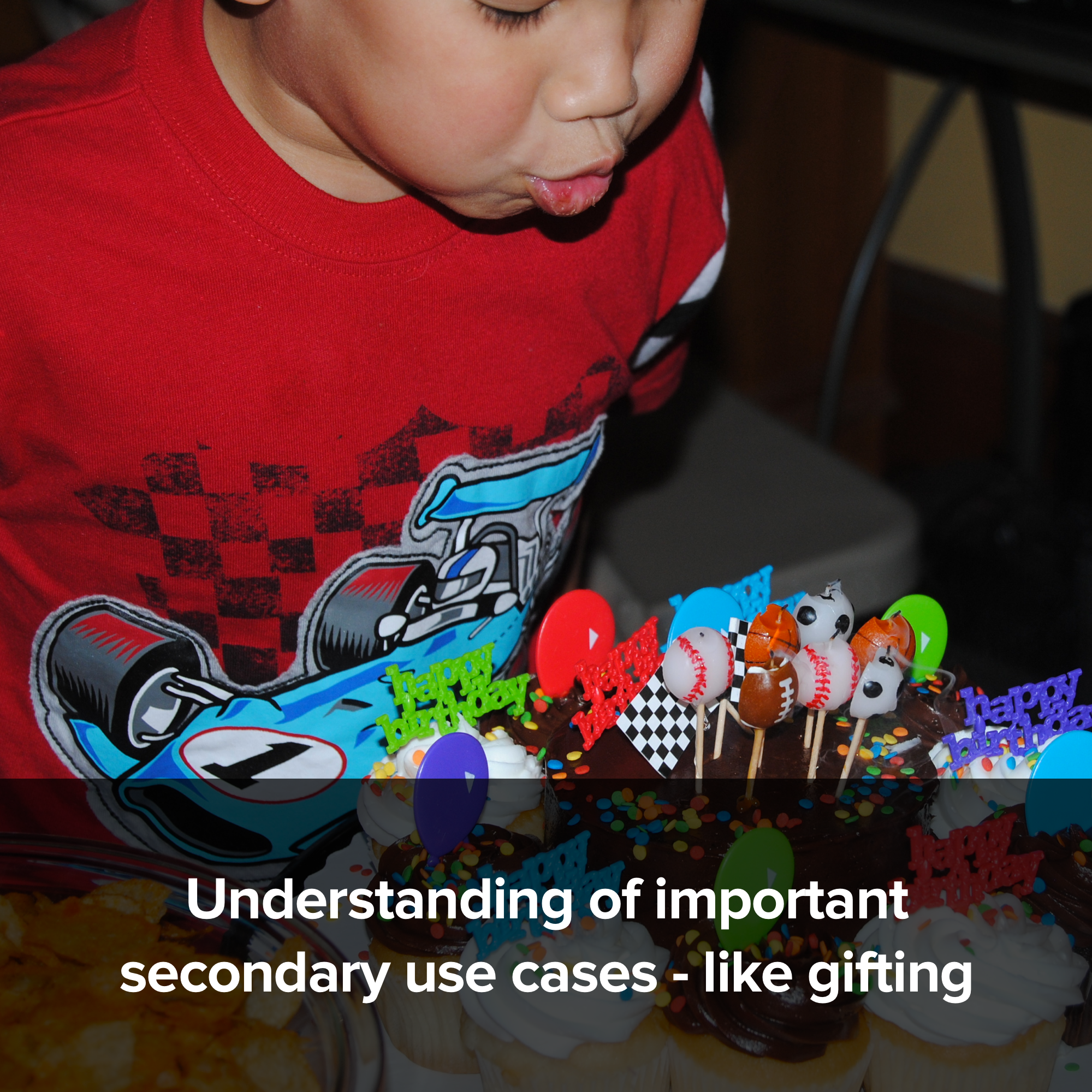
I identified users within our existing target personas and conducted generative interviews with them to better understand how they use our partners' apps.
After synthesizing findings, I created a user journey map to better understand their ideal shopping experience.
With this vision, I then had to layer in internal and external stakeholder constraints.
Based on these steps, I was able to identify three design objectives:
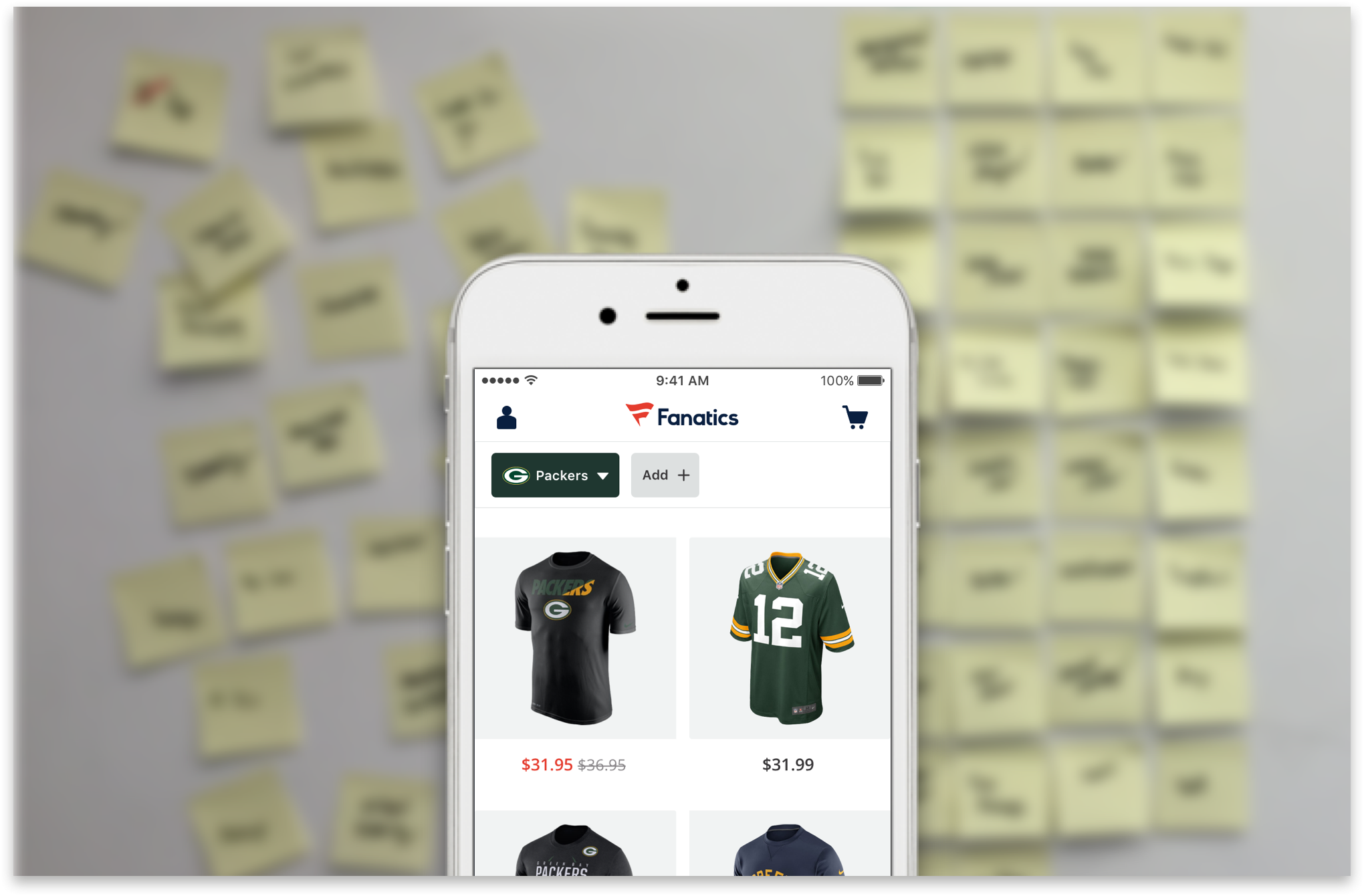
Sketching to prototyping to final recommendation
With these in mind, I executed design by quickly going from sketching to rich prototypes using Principle animation. And in an iterative process, I conducted numerous usability tests to get to the right experience.
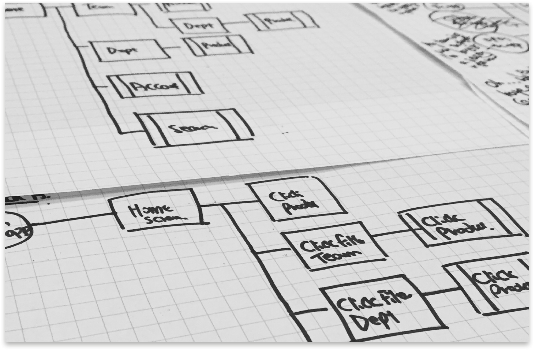
1. Sketch flow charts
I iterated on multiple flow charts and mapped out all the possible user journeys that the user can take, and also the most optimal solution for them to reach the product, based on findings from user interviews.
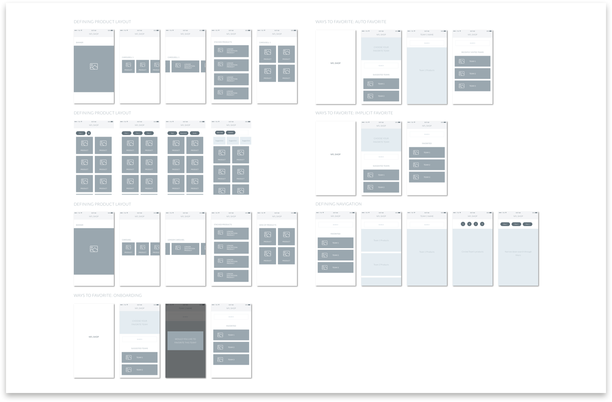
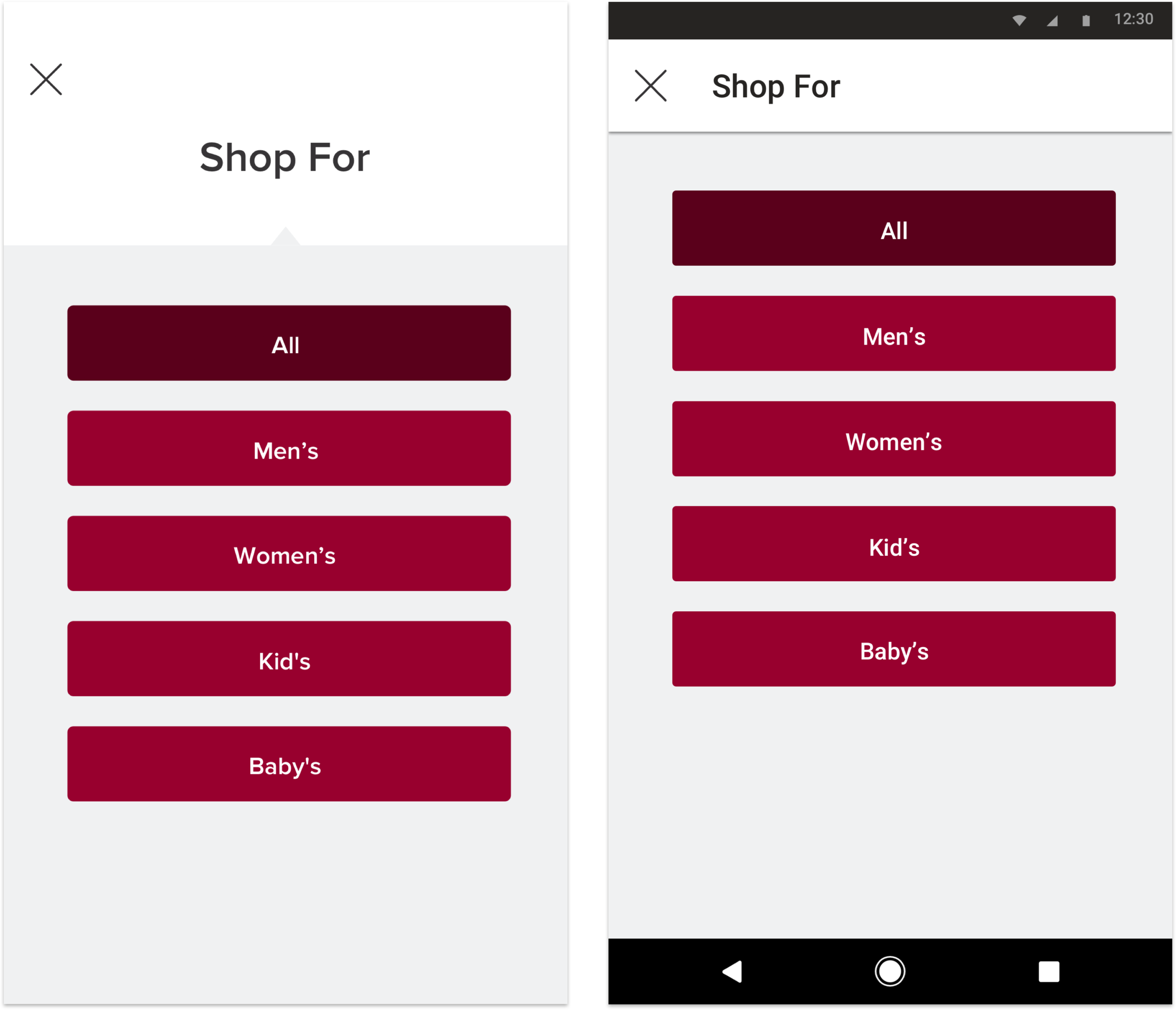
2. Create wireframes to illustrate and choose design direction
I synthesized ideas into design directions and explained our choice to stakeholders. At this stage I used wireframes to avoid potential distraction from visuals.
3. Build high fidelity mockups
Once a direction was chosen, I turned the wireframes into high fidelity mockups. Behind each design decision, there were multiple alternative assets.
4. Test with users and iterate
Key design decisions before the release always involved talking to users. I used dump & sort techniques to quickly identify pain points, and move forward with design choices. To make the prototype interactions as real as possible, we used Principle to create rich animation.
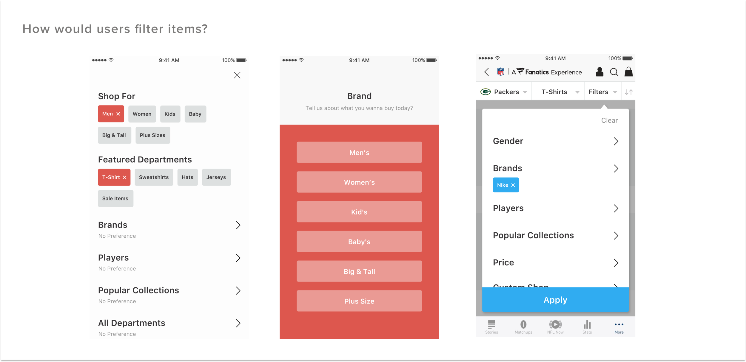
Key Design Decisions
Before & After
Before

After
Final Design
Impact
34 percent drop in accidental exit
I left before launching this project. This is based on mass usability tests with prototypes